Packaging 101 | BE Educated
First impressions count. In a retail market where products crowd shelves and jockey for space, standing out is important. Size, shape, color and texture all factor into how your product grabs a customer’s attention. In a recent study, only 11% of global consumers said that they were completely satisfied with packaging today. Why not turn up the dial on your next packaging design project with some of these attention-grabbing techniques.
Reshape your ideas
Sometimes reimaging the size and shape of your packaging is a great way to differentiate yourself from others. Consider the iconic Toblerone brand. For more than 100 years, the Swiss chocolate maker’s distinct yellow pyramid packaging has stood out proudly among a sea of flat rectangular bars. It’s important to remember that there are no hard and fast rules when it comes to packaging shape. No one ever said a pizza must come in a square box. It was just assumed. Get creative and don’t forget to take inspiration from your product. Your best ideas could be sitting right in front of you.
Be bold, be brave
Color influences emotions and inspires decision making and it’s one of the most important decisions a designer can make. Bold color trends popped up in the past few years and have begun to evolve into new territory with usage in patterns as well. No matter how you choose to use color, the rule of thumb will always be to pick hues that suit your brand’s personality and better tell its story.
Texturize for a tactile sensation
Increase your product’s touchability by adding texture and layers to packaging. You can achieve this by applying techniques such as soft touch coating, spot varnishes or uv finishing, embossing, debossing, or layering with sleeves or bands. Whether the look you’re going for is a more subtle, softer approach or something more intense, the sensation created will leave a lasting impression on the consumer.
High shine for high demand
Want your products to sparkle from the shelf, catch the light and instantly a customer’s eye? Consider foil or holographic effects. Thanks to technological advances of recent years, the price point on this special finishing option is no longer reserved just for luxury goods. Consider pairing it with black, dark, white or neutrals for minimalist or maximalist on-trend package designs that command attention.
Cut it out
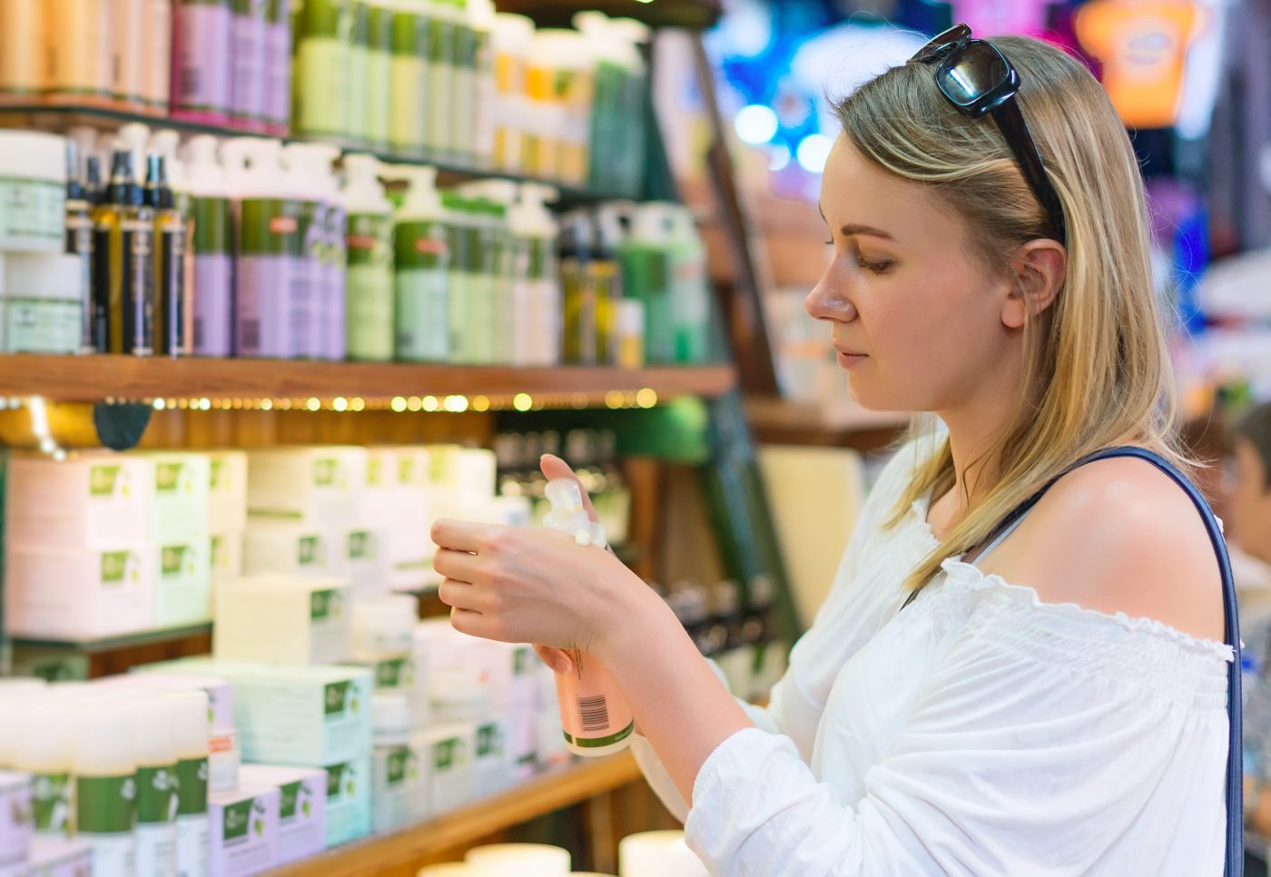
The use of negative space in design can give a fun, storytelling effect while maximizing the product’s appeal. Clever uses of clear packaging and die cuts can bring out the products natural texture and color to help drive sales. This is particularly useful in the competitive food and beauty markets where customers value the ability to see the products clearly before purchase.
There are many factors that go into creating a dynamic shelf presence and getting started can often be overwhelming. Let B&B Print Source provide some relief by partnering with them on your next packaging project.