
Customers take a special shine to metallic embellishments
Metallics used in the printing process are magnetic—to people! We can’t resist a gold medal, silver lining, bronze star or platinum-selling record. And with today’s print technologies, using these high-impact colors to draw eyes—and sales—is easier than ever.
In January we started a blog series on color theory and symbolism for designers and brands who want to use color more compellingly. Check out our most recent post on Pantone’s color of the year—and why you NEED to use it in your marketing.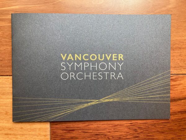
Mining for gold
You won’t find metallics on the color wheel, but there’s no denying how we’re drawn to them. Modern metallic colors are, of course, named for the precious metals that have existed since ancient times: platinum, gold, silver, bronze, and more. Although each has its own specific meanings and symbolism, they are often connected with luxury and opulence.
Gold is strongly associated with wealth and glamor, often representing the top in a category. Think of the Olympic gold medal—the world’s best athletes don’t “go for the silver”—they go for the gold! When something is considered the gold standard in its category, it’s simply the best.
Sometimes gold is considered pretentious or garish—think of the famous golden toilet—so brands should be careful to use it wisely. On the other hand, the warm, bright color is also associated with the sun through the seasons, and it can have a very uplifting and calming effect paired with natural colors or substrates.
Elegant shimmering Whites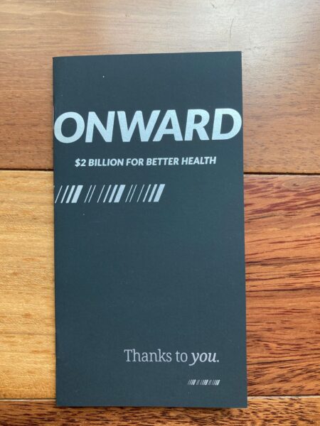
Platinum is a metal even more precious than gold and is not traditionally used as a currency in the US. Its color is usually depicted as grayish-white. The Recording Industry Association of America labels an album that sells a million copies as “platinum.” (An album that sells half a million is considered gold.) A platinum blonde hairdo is shiny white and famously connected with the glamorous diva Marilyn Monroe.
Silver can indicate wealth. When a person is said to be “born with a silver spoon in their mouth,” this implies they came from family money. Opposite of the golden sun, silver is sometimes associated with the moon. Silver is also connected to wisdom and growing older because when the hair loses pigment late in life, it grows as silver.
Bronze is grounding
Gold, silver, and bronze have long been associated with the Olympics and other competitions, with each medallion represented in order of preciousness. Bronze is a combination of copper and tin, and it’s known for its distinct orange-brown shade. Bronze is considered a strong, sturdy color and is connected with a healthy body or an earthy quality.
Metallic printing is easier than ever
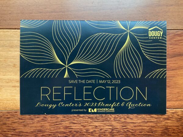
A metallic effect can be used in the traditional colors mentioned above, but it can also easily be combined with other pigments, like red, blue, and green, using offset and digital print techniques or with foil embossing. Designers can also achieve a metallic look by layering metallic ink or toner under another color and using a glossy substrate to amplify the whole effect.
We can help you decide what effects and embellishments are right for your brand and your customers. Then we put the pedal to the metal—and get it done!
B&B Print Source is excited to launch a blog series on colors and what they mean for your design, print materials, and brand. Watch this space for the rainbow of information, and connect today for a color consultation on your next print, packaging or graphics project.