
Did you know there’s a color of the year? Cause for celebration in the design and printing world, the annual Pantone release inspires collaborations, rebrands, and textile trends across the globe. The 2023 color of the year is Viva Magenta, and just in time for Valentine’s Day, we want to tell you all about it—including how to use this bold hue strategically in your marketing materials.
Waaaay Back in ’63
For those who don’t know, the Pantone Matching System (PMS) was created in 1963 and allowed for the selection, articulation, and reproduction of consistent, accurate color anywhere in the world. The tool organizes color standards through a numbering system and chip format, which have become iconic in the industry.
First, a word on Viva Magenta from Pantone, itself.
Pantone’s Color of the Year, Viva Magenta 18-1750, vibrates with vim and vigor. It is a shade rooted in nature descending from the red family and expressive of a new signal of strength. Viva Magenta is brave and fearless, and a pulsating color whose exuberance promotes a joyous and optimistic celebration, writing a new narrative.
This year’s Color of the Year is powerful and empowering. It is a new animated red that revels in pure joy, encouraging experimentation and self-expression without restraint, an electrifying, and a boundaryless shade that is manifesting as a stand-out statement. PANTONE 18-1750 Viva Magenta welcomes anyone and everyone with the same verve for life and rebellious spirit. It is a color that is audacious, full of wit, and inclusive of all.
“In this age of technology, we look to draw inspiration from nature and what is real. PANTONE 18-1750 Viva Magenta descends from the red family, and is inspired by the red of cochineal, one of the most precious dyes belonging to the natural dye family as well as one of the strongest and brightest the world has known. Rooted in the primordial, PANTONE 18-1750 Viva Magenta reconnects us to original matter. Invoking the forces of nature, PANTONE 18-1750 Viva Magenta galvanizes our spirit, helping us to build our inner strength.”
Leatrice Eiseman, Executive Director, Pantone Color Institute
The M has it!
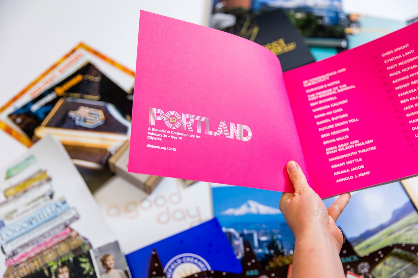
As anyone in printing knows, magenta is a primary color in the CMYK color model, which also includes yellow and cyan, and along with black, creates the full-color spectrum for modern printing. It is a secondary color in the RGB color model used for digital displays.
However, magenta is an extra-spectral color, meaning it isn’t found in the visible light spectrum, and it’s perceived as a blend of red and violet light, with the absence of green, which is its complementary color. There seem to be as many iterations of magenta as there are designers, ranging from deep purple to hot pink to brick maroon. Pantone’s Viva Magenta is closest to the historic red derived from cochineal insects, dating back thousands of years, and still used in food and textile dyes today.

Magenta is technically identical to fuchsia and was originally called fuchsine in French until it was renamed after a battle in the 19th century that took place in a small town called Magenta. It is a vibrant and assertive color and should be used judiciously in design, tending to draw the eye wherever it is placed. However, it is generally considered a welcoming, friendly, and balanced hue, ubiquitous in flora and complemented naturally by verdant foliage.
Viva Magenta is a bold color of the year, yet it fits seamlessly into a variety of color palettes. We are certain to see it utilized in lots of unexpected places in 2023, from mobile phones to billboards to textiles and beyond—maybe even in your brand!
It’s all about Color
B&B Print Source is excited to be curating in 2023 a blog series on colors and their meaning for your design, print materials, and brand. Watch this space for the rainbow of information, and connect today for a color consultation on your next design.