
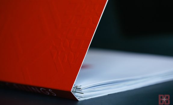
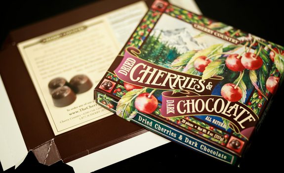
Are you seeing red? We’re not surprised—brands use this powerful color extensively in marketing, advertising, and awareness campaigns. And they should.
Last month we started a blog series on color theory and symbolism for designers and brands who want to use color in a more compelling way. Check out our first post on the best ways to use the blues.
Red is one of the earliest pigments found in use, with dyes originating from clay, iron oxide, and later, crushed insects. And the term red historically refers to a whole range of colors depending on the tint, shade, or position on the color wheel.
Red has both positive and negative connotations, but in general, it’s agreed the color (especially in its purest form) is considered a powerful call to action, full of passion, strength, and emotion. It is a primary color and a ”warm” hue alongside orange and yellow. In fact, it’s the hottest color there is.
In the U.S., red is strongly associated with love, attraction, and sensuality. When combined with shades of pink, the spectrum of reds and its lighter tints give us the palette for which Valentine’s day is famous. We give red roses, display red hearts, and tie red ribbons around our gifts. The passion for red during this holiday is usually tempered with white, a color of purity and chastity, and pink, the hue of the sweet cherub Cupid’s cheeks. The trio is found in the classic candy hearts mix and on the ubiquitous greeting cards given in February. In China, red is associated with prosperity, happiness, luck, and new beginnings.
Red is also associated with rage, confrontation, and patriotism, oh my! Think of the common yet effective stop sign. The terms “seeing red,” “red light,” “red card,” “caught red-handed,” “red tape,” and “going into the red” all have negative associations. In Russia and around the world, red is associated with communism. In South Africa, red is the color of mourning.
Symbolism and cultural association are important—especially in global campaigns—but smart designers and marketers know the true power of red is in its effect on the nervous system. Looking at the color red has been shown to increase heart rates. A slightly increased heart rate makes the blood pump faster, speeding up metabolism and other biological processes.
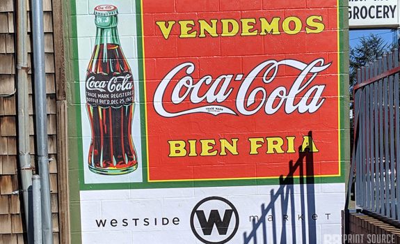
The color red can literally make you hungry and increase your urgency around decision-making, which is why we see so many red logos and signage at stores and restaurants. The draw toward red might also explain why Coca-Cola consistently tops beverage sales over its more cool-colored caffeinated competitors, Pepsi-Cola (blue) and Mountain Dew (green)—exceeding $36 billion in 2021 sales alone.
Brands can capitalize on red by using this strong color strategically—as a logo, a call to action, or a redirection. Red can liven up an otherwise subdued palette as a spot or accent color or bring a consumer’s full attention to a sale or event by splashing it across signage.
Roll out the red carpet for this impactful color—you’ll be glad you did!
B&B Print Source is excited to launch a blog series on colors and what they mean for your design, print materials, and brand. Watch this space for the rainbow of information, and connect today for a color consultation on your next design.