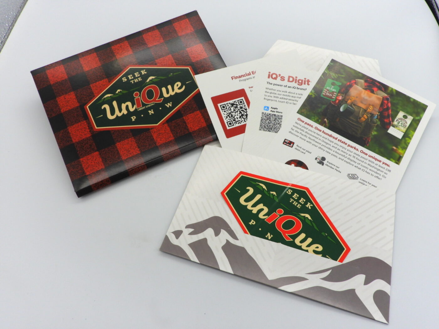
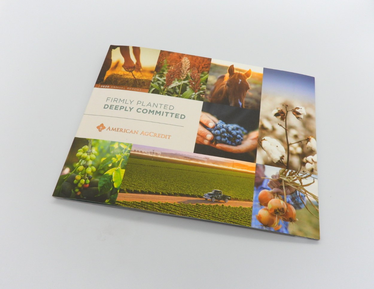
(and a bunch of other things too!)
Just in time for the most emerald holiday on Earth—St Patrick’s Day—we give you the meaning of all things green. Green means go! It also communicates prosperity, sustainability, growth, and serenity.
In January we started a blog series on color theory and symbolism for designers and brands who want to use color more compellingly. Check out our most recent post on Pantone’s color of the year—and why you NEED to use it in your marketing.
 The meanings of green have evolved and shifted over the years in the U.S. Since the earliest printing of currency (the greenback), it has been synonymous with money, wealth, and prosperity. Deep, emerald green is often used in luxury packaging and campaigns.
Universally, green is associated with a lush, verdant landscape, rolling hills, tree cover, and natural abundance. Chlorophyll, the deep green pigment in plant cells that creates energy, is the color of nearly every leaf and stem on the planet. Politically, the “green” movement is focused on ecology, sustainability, environmental health, forest preservation, and climate stability and is probably the message most closely tied to the color green in popular culture right now.
Green has also come to symbolize legalized recreational marijuana, and medical marijuana dispensaries often hoist a green cross to call attention to their products and services.

Positioned between blue and yellow, green is a secondary color on the color wheel and a primary color in the RGB color model used in digital displays. The cool color tends to create a calming background, the perfect foil to pops of color such as red, white, fuchsia, blue, and yellow, as we would enjoy in a flower garden. We rest our eyes on a green lawn or lush foliage while stimulating the senses with buds and blooms.
Designers should take care – some green varieties have strong associations that may not be as audience friendly. The ancient Greeks (and later Mark Twain) intertwined green with envy and jealousy. Olive green can evoke the military. Sometimes a yellow undertone is used to illustrate sickness or nausea.
But on the whole, green is a mostly positive, friendly hue frequently used in messages featuring luxury brands, sustainability, and nature. It can also be a smart color for popping CTAs and logos off an otherwise neutral palette.
Check out how well-known brands such as Starbucks, John Deere, and BP have turned green into gold.
Consider giving this Celtic color the green light—and do it fast, or you might just get pinched!
B&B Print Source is excited to launch a blog series on colors and what they mean for your design, print materials, and brand. Watch this space for the rainbow of information, and connect today for a color consultation on your next print, packaging or graphics project.

