When it comes to printing professionally, sending print-ready files is crucial. Use our top 12 tips below to ensure your file is ready for the press and save you both time and money.

Still Have Questions? Need additional guidance? Just reach out. We’re here to assist!

Contact us

  • Get crisp lines on your printing

    Use Adobe Illustrator or another vector-based program (Adobe InDesign, QuarkXpress) to get crisp lines on your line art printing. Do not use Adobe Photoshop for your text. Edit photos or add special effects to your printing design in Adobe Photoshop, then place the artwork into your vector-based application to add the text. This technique will produce crisp graphics on your finished printing project without the fuzz.

  • Adobe Illustrator

    Use Adobe Illustrator to create vector graphics (e.g. logos) that you can place in your page layout program (Adobe InDesign or QuarkXpress). Once you have finalized the graphic design, convert any fonts used to outlines so the graphic can be reused many times without font issues arising. We recommend saving Illustrator files as .ai file or a .pdf (if you save it as a .eps it will be flattened and special effects such as transparency are no longer editable).

  • Get a deep, rich black on your printing

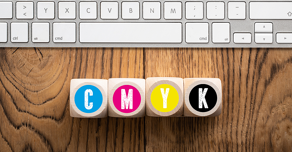
    Use the following CMYK values for black (do not use for text smaller than 48pt). Cyan – 40%, Magenta – 30%, Yellow – 30%, Black – 100%. The text should be black only unless it is large (over 18pt) headline text and then it is okay to use the 40c, 30m, 30y 100k build.

  • Digital Printing

    Text for digital printing works best with Black at 100% – no C, M or Y.

  • Avoid using Microsoft Applications

    Microsoft applications are easy to use for printing on your desktop printer, but for commercial printers, Microsoft apps create problems. Yes, we can print from them, but problems may arise to slow down production. Microsoft apps substitute fonts without letting you know, so objects may shift without your knowledge. Also, your resolution might not be high enough for the best quality color printing.

  • Make Sure All Images Are In CMYK Color Mode

    Convert all RGB images to CMYK color mode to ensure the best color on your final printing pieces. Our equipment does this for you, but you will get better results if you do this in Adobe Photoshop before submitting it to us.

  • Optimize your photos for final printing

    Have your photos in CMYK color mode at 300dpi resolution. This will give you the best quality image on your final printed materials.

  • Use Pantone Color Swatches For Best Color Matching

    Your screen uses lights to view a color. All monitors are calibrated differently. What you see is not what you will get. Your inkjet or laser printer uses different types of inks or toners than commercial printing presses. Generally, the color from your inkjet or laser printer will not match exactly to our printing press. Use Pantone PMS values for the best results.

  • Don't place text too close to edge of printing

    We cut down printing projects in large stacks. There might be a slight shift toward the bottom of the stack. If the stack shifts just a hair, graphics that run to the edge can get cut off. A safe rule of thumb is to allow 1/4″ margin from edge.

  • Print and review a proof on your desktop printer first

    Before submitting a file for printing production, take time to print and review it on your desktop printer. If you encounter postscript errors or image shifting, we will most likely encounter those same problems. For quick turnaround time, make sure your files are accurate before submitting for final printing.

  • Package Files

    Both InDesign and Illustrator have options for packaging your files. Include a PDF/hard copy so we know what you are seeing. Check to the include .idml too.

  • Using Canva?

    Download this PDF on How to Get a Press-Ready PDF from Canva: A Step-by-Step Guide.

    Download