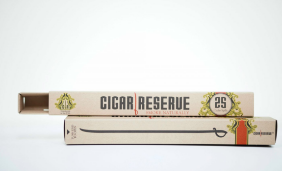
Make it a big, bold advertising statement
Packaging Trends continue to point towards making a bold statement on the shelf and online. Advancements in printing, folding, boxing, and shipping have made even avant-garde package designs available to most modern businesses and organizations.
Here are some ideas to keep in mind as you look for ways to catch the eyes—and the budgets—of your customers in the coming year.
Pack a punch with packvertising.
What is packvertising? Coined by a creative agency in pursuit of a powerful packaging campaign for a cereal company, the concept has filtered through to brands around the globe, and we’ve seen massive shifts at the grocery and beverage stores everywhere—not to mention online.
“Not having advertising to build a brand is actually a fabulous constraint,” maintains Big Fish Founder and Creative Director Perry Haydn Taylor. The creative agency aims to design packages that stand out not only on the store shelf but also in the cupboard and on the breakfast table.
Packages can be a brand’s own best advertising. Brands are already investing every day in packaging that is thoughtfully designed, printed, created, filled, and ultimately shipped. Why not include in the engineering that it is paid advertising that can boost an entire omnichannel marketing approach?
Packvertising uses seven key principles:
- Bring your brand proposition to life.
- Treasure your brand packaging assets.
- Let your product speak for itself.
- Make a real statement on the shelf or online.
- Make your packaging part of the brand experience.
- Respect and embrace sustainability.
- Balance freshness with consistency.
Contemporary design trends capitalize on many of these principles.
Detailed illustrations.
 Scientific, technical, and ornamental drawings are jumping off boxes at the market. Illustrations can show, rather than tell, what is inside the package. They can be used to communicate a mood or a historical era. Detailed illustrations draw the eye in and hold a consumer’s attention longer to consider or unpack the meaning of the image. The whimsical Blue Lobster cardboard can pack is an excellent example of fun illustrations that appeal to adults.
Text, fonts, and slogans, oh my!
A picture may be worth 1,000 words. But 1,000 words give consumers something to mull while reading your box or package. A trend toward stand-out fonts and text-heavy packaging is responding to the shopper’s need to connect. With so many choices, consumers are turning more frequently to brands with a story that resonates. And if you’re packvertising, then your box is the place to tell that story.
This year’s words across the web, advertising, and packaging are more, well, readable. Today’s popular marketing fonts emphasize legibility and clarity, creating a welcoming, warm and inclusive message in appearance alone.
Brandcentricity.
We’ve learned in recent years that the boldest thing we can be is ourselves. And that goes for brands too. When designing packaging, consider your brand first, then carry it out to its fullest on your box or packaging.
If you are an eco-friendly brand with products that show your values, design your package with simple, rustic colors and use minimalist recycled paperboard. If your brand is associated with a specific group like dads, or preschoolers, or LGBTQ folks, or motorcycle enthusiasts, speak directly to your audience with your package. Use colors, metallics, and embellished finishes to draw them in and language your buyers can relate to. At the same time, stay away from tired cliches.
As you’re thinking about ways to step outside the box with your packaging this year, consider the principles of packvertising, and bring a fresh message right to your customer’s door.
Whatever your era—or aesthetic—B&B Print Source offers agile and flexible branding and packaging design that will delight even your most practical customers. Contact us today to start designing packaging that pops.


