Embrace blues, boho and BOLD colors to boost your brand in 2024
Looking across the 2024 colorscape, some strong trends have emerged among the major brands, including paint companies, design houses, and media. Print and packaging professionals watch these trends closely to help our customers stay ahead of the pack. When it comes to branding, signage, direct marketing and apparel, it pays to know what appeals to consumers and what will make them choose your goods and services and over your competitor, including bold colors and trends that change seasonally.
The blues are back
A survey of the various 2024 colors of the year includes a variety of breezy, uplifting blues–neutrals not, but rather blues with a backbone–statement colors that can carry an entire room.
Blue Nova by Benjamin Moore is the most grounded of the blues, displaying a sober, traditional tone “with classic appeal and reassurance,” Andrea Magno, color marketing and development director at Benjamin Moore, said in Better Homes and Gardens Magazine. Far brighter blues, Thermal By C2, Skipping Stones by Dunn-Edwards, and Upward by Sherwin Williams, carry more swagger and sunshine than Blue Nova while offering a vintage vibe.
Read our blog series on color theory and symbolism for designers and brands who want to use color more compellingly.
In 2024, Pantone is peachy keen
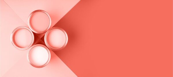
Pantone’s 25th annual color of the year is Pantone 13-1023, also known as Peach Fuzz, a delightful hue between pink and orange that serves as a mood brightener on paper, clothing, walls, packaging…and everywhere in between.
As described by Pantone, “Peach Fuzz is a heartfelt peach hue bringing a feeling of kindness and tenderness, communicating a message of caring and sharing, community and collaboration. A warm and cozy shade highlighting our desire for togetherness with others or for enjoying a moment of stillness and the feeling of sanctuary this creates, PANTONE 13-1023 Peach Fuzz presents a fresh approach to a new softness…..Poetic and romantic, a clean peach tone with a vintage vibe, PANTONE 13-1023 Peach Fuzz reflects the past yet has been refashioned with a contemporary ambiance.”
Forest for the win
Valspar, Graham and Brown, and Dutch Boy have doubled down on earth tones in 2024, capitalizing on the “cottagecore” and “forestcore” movements, which are inspired by deeply natural spaces and have sparked a resurgence of the 1970s Boho aesthetic in all its macramed glory.
What does it all mean for our clients?
In 2024, color trends in marketing and packaging design are evolving, reflecting the dynamic nature of consumer preferences. Brands leverage these trends to create visually appealing and impactful designs that resonate with their target audiences.
For 2024’s boldest color choices, check out this link.
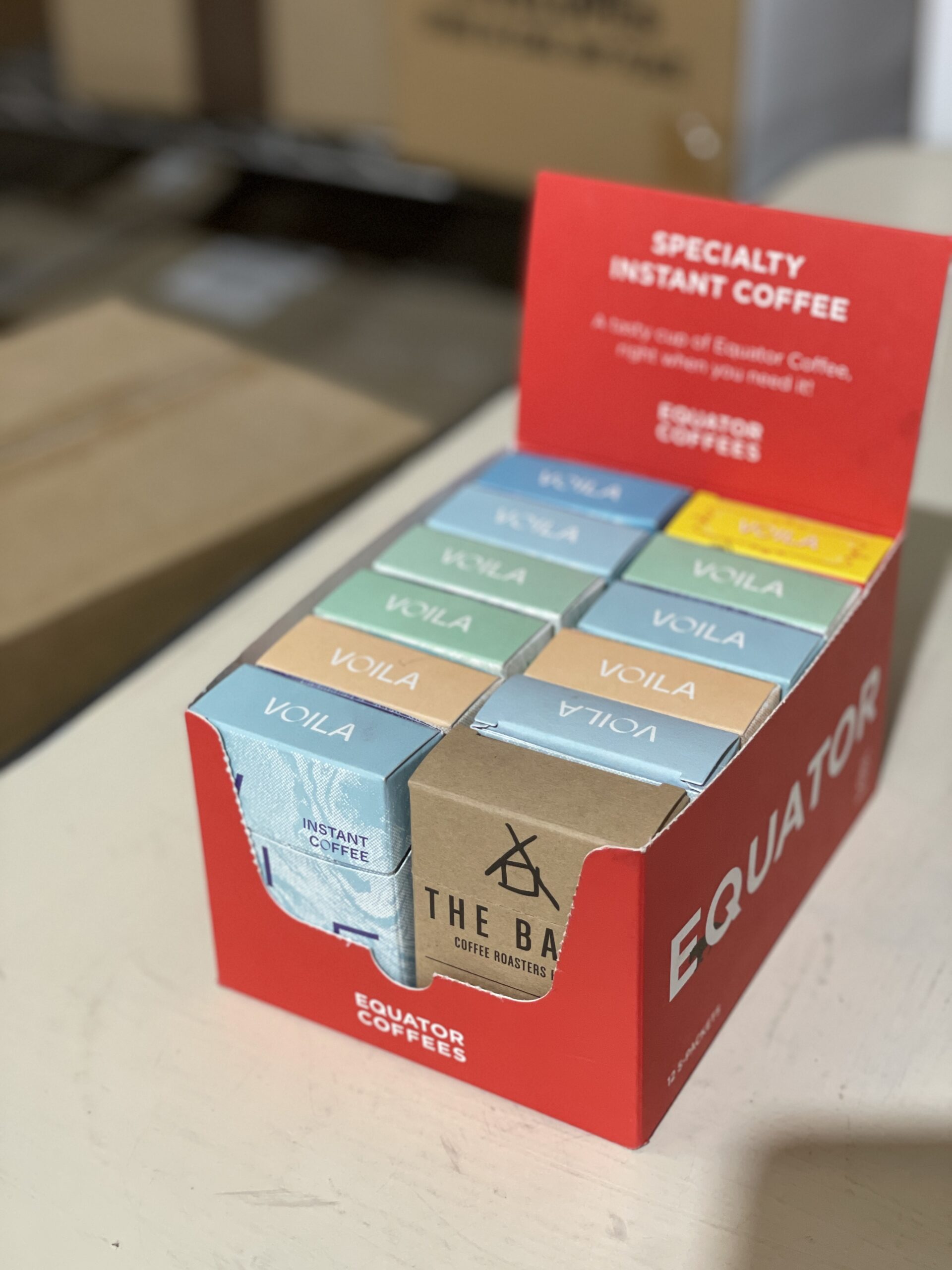
Bold and Vibrant Color Schemes. The use of bold colors in wild combinations continues to be a prominent trend in packaging design for 2024. Brands are opting for eye-catching hues to grab consumers’ attention and convey a lively and energetic brand personality.
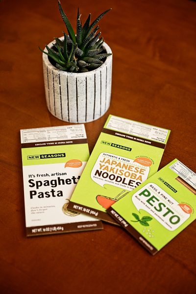
 Color Variants in Food Packaging. Specifically in the food industry, color variants remain a popular trend. Brands are exploring diverse color palettes to enhance the visual appeal of their products. This trend is driven by the understanding that colors play a crucial role in influencing consumers’ perceptions of food products.
Saturated Pastels and Radiant Colors. Print and packaging designs are embracing saturated pastels and radiant colors in 2024. These hues add a touch of sophistication and modernity to product presentations and fit right in the rainbow with Pantone’s Peach Fuzz. Saturated pastels tweak the conventions we’ve come to expect from pastel shades. Traditionally soft and subdued, pastels have been dialed up a notch, according to VistaPrint’s 2024 trend watch, now embodying a vibrancy that’s both playful and potent.
Clean and Earthy Colors in Sustainable Packaging. Sustainability continues to be a growing concern, and brands are incorporating clean and earthy colors to align with eco-friendly initiatives, following the back-to-nature aesthetic mentioned above. Natural tones and environmentally conscious color choices are becoming integral to packaging designs, reflecting a commitment to sustainability.
B&B Print Source is excited to be your partner in design and help you use color to brighten your print materials, packaging, and brand. Watch this space for the rainbow of information, and connect today for a color consultation on your next print, packaging, or graphics project.

